Planning Stage
About Spinshot
Front cover plan
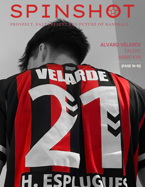
For the front cover, my plan was to try to move away from convectional sports magazine covers. Rather than the typical front-facing pictures in all magazines, my first idea was to capture the player from behind. This would allowed me to emphasise more into the player's name and number rather than his face. This visions would aligned perfectly wiht the Rising STARS section. I also planned of making the magazine black and white but leaving tred in full colour. By selecting a powerful colour like red, I am able to create a great contrast while drawing attetion to key elements of the cover. Red also represents passion, love and intensity, aligning with the magazine's passion for handball .This will create an unmatched visual aesthetic that makes the magazine to stand our on newsstands or ant digital platform. Here is a skecth of my plan:

However, after creating some rudimentary sketches It was clear that this implementing this idea with a professional and luxurious end could becone challenging. The ideas of featuring a player's back as the cover, while being strong on paper, lacked the neccesary tone to tryly capture the premium aesthetic I intend for the magazine. And even thought keeping color red was an interesting idea, I found a better use of it in the article section rather than at the cover. Ultimately, I opted for a more convenctional way as my final plan. A front facing picture full of colour. This was the best choice to allow me to get a polish/high-end look, combining classic elements wiht modern visuals and fonts.
Table of contents plan
My plan for the table of contents was to create and explore as many sketches and concept plans as possible. I knew that the table of contents needed to follow the aesthetic of both the two page article and the cover. Therefore I focused on generating ideas, allowing me to adapt the table to any style direction the other two elements could possible take. I got inspiration from magazines across genres, not just sports magazines, to desing elements that felt artistic and visually attractive for a handball sports magazine.
Two page article plan
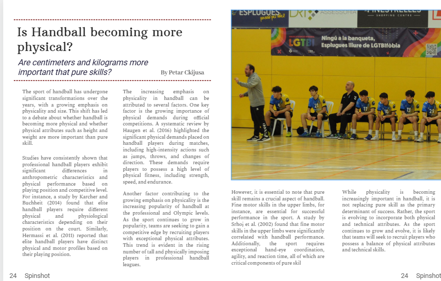
For the two-page article, my main idea was to create a clean two page spread article that had an image on its top right corner. I think this setup keeps focus on the text while maintaining a clear flow for the picture. I wanted to keep it simple and neat, to align to the luxurious look I wanted to achieve. I also wanted to introduce red elements to the article as red it the color brand of the magazine. Here is a sketch:

However, this first main idea was not convincing enough when put side to side to the cover and table of content. It did no look like it all came from the same magazine, that is why I decided to do a one page article while leacing the other page with a collague of picutes of the athelete.
